Rexius Records
Brand Guideline
Introduction
Vision
Helping all artists in the pursuit of their goals.
Mission
Amplifying artists striving for growth.
Tagline
Amplifying music.
Bio
Amplifying artists striving for growth and independence no matter genre or the number of fans.
Our Values
We stand up for any artist striving for growth and independence no matter genre, or the number of fans. What matters is the music itself and the passion for getting a little bit better every day.
We strive to make the music industry fairer. We believe in an equal world where we respect and are kind to each other no matter who we are. That means we don’t tolerate any kind of discrimination. We aim for long-term visions but only work with short agreement terms. And we always allow for the artist to have 50% or more of the royalty split.
Our History
From a one-man living room studio created in 2013 to a team with members, partners, and artists from over 20 countries (and counting!). Rexius was founded by Mathias Rexius, a professional guitarist born in Gothenburg and educated at the Music Institute in Los Angeles. After years on the road as a touring musician, he grew tired of the unjust culture in the music business, and decided to quit his career and instead focus on building his own company which would work as a counterpoint to the traditional majors.
A company that works from an artist’s point of view, elevating hard-working rookies and upcoming artists with the knowledge for them to create their path to success. With strong disbelief in gatekeepers, Rexius Records was founded with the core belief that both valuable knowledge and good music are meant to be shared.
Manifesto
We’re Rexius, and we’re not a record label. Even though we help artists, bands and music creators to evolve every day, making their music heard.
Neither are we a distributor. Even though we put our heart into developing digital tools that help us spread good tunes all over the world with smart, automatic processes.
And we’re not a PR Company either, even though we work with an international network of music lovers on a daily basis.
There are many things we’re not.
And we believe that’s our strength.
We focus only on what we believe in.
And that is helping artists help themself.
You bring the ambitions, the hard work and the why’s.
We bring the knowledge, the experience and the how’s.
We’ve been in the music industry for several years now, and we’ve learned. A lot.
We believe in sharing that knowledge.
We believe in being fair players in an unjust industry.
We believe in being the worst gatekeepers ever by leaving the door wide open.
We’re Rexius,
And we’re an Amplifier.
About Amplifying
We have for a long time used the motto to take music to the next level, with the implication that we lift the artist/their music as a crane to the next level, where the artist is some kind of passive object and we do the heavy lifting. We have all the tools for an artist to reach out to a new audience, but the artist is the active force. The artist still needs to play the strings so to speak, in order for anything to happen.
Simply put we believe in teaching how to fish, rather than giving fish. We believe in being the coach on the sideline, while you score the goals. We’re with you on the journey, but it’s your effort that we amplify.
- The artist is at the core of everything, without them there is nothing to amplify.
- We amplify music, making music go farther than without us.
- We give artists the knowledge and tools to help themselves.
- We build the resources, networks and tools for artists to use.
- We, indirectly, help a lot of artists by creating these tools, and not building artists directly.
- We are not tied to a certain group of artists, if a record label, distributor or management would like to use our tools, we are here to help.
Brand Identity
The Rexius Records Brand Persona
Johan Andersson is a singer-songwriter from Uppsala with an interest in music production. He is single and lives alone with his cat. He is 27 years old and studying to become an engineer, but dreams about touring the world… Or at least making a living on his music.
Challenges
What serves as a roadblock to this person’s success?
- Promoting music on social media
- Get their music in front of the right audience
- Get listeners
- Getting signed to (the right) record label
- Monetizing their career
- Personal branding
- No connections
- Gatekeepers
- Only aware of the major/traditional way
Search Terms
What do they actively research online?
- Music Marketing
- How to get a record label to sign you
- Submit Demo
- How to promote your debut release online
- How to get into Spotify Editorial Playlists
Marketing message
How can we describe our solution to have the biggest impact on this persona?
- Gain more fans
- Visibility and engagement
- Give them a solid platform for growth
- Gain knowledge about the industry
- Taking their music career to the next level
- DIY with help from professionals
- More streams
- More potential of getting booked by agent & management
What can we do?
To help this persona achieve their goals?
- Artist guidance and development
- Music licensing
- Art and visual content
- PR and branding
- Music production
- Helping them monetize their career
Communication
Tone of Voice
In general terms, our writing style reflects the following traits:
- Friendly
- Strong
- Community (team)
- Driven, ambitious
- Fair, honest (straightforward)
Which, in written language, translates to:
- Short and very concise
- Correct but not too formal
- Language in the plural when using the first person (“we”, “us”)
- A sense of teamwork and community beyond merely corporate (“Artists” instead of “Clients”)
- Some exclamation marks are allowed once in a while (to sound encouraging or energetic)
Social Media
The purpose of our social media channels is to spread knowledge and inspiration about the music industry and build brand awareness. Though we always target potential and already signed artists, management, and music creators we have some different strategies depending on the channel.
We’ve gathered all information about how we work with social media in this spreadsheet.
We have a distinctive color row in our Instagram feed. If we need to make posts in between our scheduled posts, we use our secondary colors and then continue the order as usual.
Visual Brand
The Rexius Records logo is the most recognizable element of our brand. Our main logotype represents our way of how we work together to create something bigger.

Our symbol is closely connected to the symbols of both plays and fast forward. We like to represent the digital era of streaming music, as much as the direction in which way we’re taking the music industry. Into the future.
Give the logotype some room to breathe, with at least 100% of the height and width free from any other design elements.
Typography
Soleil is our house font. It’s a tranquil and fresh geometric sans font family for clear text and headlines. We use it in bold, light, and regular for both print and digital applications. When Soleil isn’t available, we use Lato.
Soleil is available on Adobe Fonts, while Lato can be found on Google Fonts.
Soleil
A B C D E F G H I J K L M N O P Q R S T U V W X Y Z
a b c d e f g h i j k l m n o p q r s t u v w x y z
Lato
A B C D E F G H I J K L M N O P Q R S T U V W X Y Z
a b c d e f g h i j k l m n o p q r s t u v w x y z
Colors and Gradients
With one foot in the tech industry and the other in the music business, our color palette is an obstinate will to do the exact opposite of what’s expected of us as a record label. Our palette is vibrant, inclusive, and modern – just like our company.
To ensure good readability and brand coherence, it’s important to pair the colors correctly. Pentatonic Petrol can be paired with all other colors, while Theremin Turquoise only should be paired with white. Yung Yellow and Pop Pistage should only be paired with Pentatonic Petrol.
Our secondary colors on the bottom row can be used as an accent in our communication when we have to do something that’s a little bit outside the box. Use these colors sparingly. These colors should only be paired with white.
The colors are also visible in the gradients that we use for imagery. The gradient map ensures that our visual communication is on-brand even though we use open-source images.
Pentatonic Petrol
#333F48
Pantone 432c
Theremin Turquoise
#6BCABA
Pantone 570c
Yung Yellow
#FFE885
Pantone 2002u
Pop Pistage
#BDE9C9
Pantone 2253c
Contemporary Cobalt
#3D3DE8
Rhythmic Red
#E54B15
Pizzicato Pink
#E77EED
Graphic Elements
Our graphic elements enrich our look. The patterns and shapes are a mixture of both sharp and smooth, which connects to our logo. Use the elements to illustrate ideas and fortify our look.
All of our graphic elements, colors, and patterns can be found here.

Guides
If you point someone in the right direction, you give them information to get on the right path. And that’s basically the core of our day-to-day work. Guides can be found as a symbol in our house font Soleil.

Arrows
With a strong relationship to our logo, the arrow pattern symbolizes a greater movement going forward. This arrow should only be used as a pattern, and not as a single detail.

Circles
The rounded shape is the organic opposite of our sharp arrows. While we gladly point out directions and constantly strive for progress, we also value softer subjects. Like being a good colleague and staying fair in an unjust industry. The circle may be used as a single detail or as a part of a big pattern.
Photography Guidelines
Photography Guidelines
Photography can be a powerful creative tool that helps to project the Rexius Record brand in the way that we like. It can also help to bring consistency to our brand material and give a premium feel to our work.
We don’t have the resources to provide our own photographs, therefore we use free stock photos. Recommended websites to use are Pexels.com and Unsplash.com.
The following chapter explores the reasons why a photographic style is important. It introduces the elements that make a Rexius Records photograph and gives example images for further reference. By following the rules in this guideline we ensure that Rexius Records continues to have a distinctive and recognizable visual style.
- We work with humans, therefore we should strive to always include persons in our photographs in some way as long as it makes sense to the story we’re telling.
- Avoid staged photos of people staring at the camera, instead try to use engaging images of people enjoying themselves.
- Avoid clutter. Ensure there is one clear focal point and don’t complicate the image with unnecessary details.
- Include people of all colors, genders, body types, and ages.
- Don’t go for the generic stock photos. Try to find something that feels real.
- Always use the Rexius Records gradients unless your Art Director tells you otherwise.


Although the images you’ve just seen cover a range of different subjects and styles, they all adhere to the following three principles:
- Illustrate the benefit of our services through human experience.
- Always use a friendly perspective.
- Work with tone and contrast.
The following chapters explore how to apply these principles in detail.
Illustrate the benefit of our services through human experience
Instead of showing just products or technology, show the experience and benefits that it delivers too.
If we’re talking about songwriting, use a picture of someone writing it down or singing, not just a picture of a piece of paper. If we’re talking about our studio services, show someone creating in the studio, not just the equipment.
Good

This image clearly shows the benefit of the service for the artist.
Okay

This image shows some human interaction with the service, even though it’s quite anonymous.
Bad

A generic photo of the product without any humans showing how to use it or the benefit of it.
The Friendly Perspective
Use photos that showcase the subject as a friend of yours. Portrait the people as a nice fellow you’d like to hang out with. Our point of view when selecting photos should reflect the way we treat our artists. We’re the fans, friends, and family that’s cheering on the sideline regardless if it’s on set or in the studio.
Good

A happy person photographed in eye level, smiling and having a good time. ”Hello there, friend! Good work with the drums. :)”
Not really

A person at eye level for sure, but do we really get the friendly vibe here?
Bad

We’re not working with superstars. Neither are we not just a person in the crowd. Find the balance in the relationship between the subject and the viewer.
Tone and Contrast
Aim for photos with good tone and contrast harmony. The controlling tone is a way of drawing the viewer into a particular area of the image and providing a focus on the right things. Avoid clutter and jumbly photos, and aim for smart compositions which allow the image to breathe.
Good
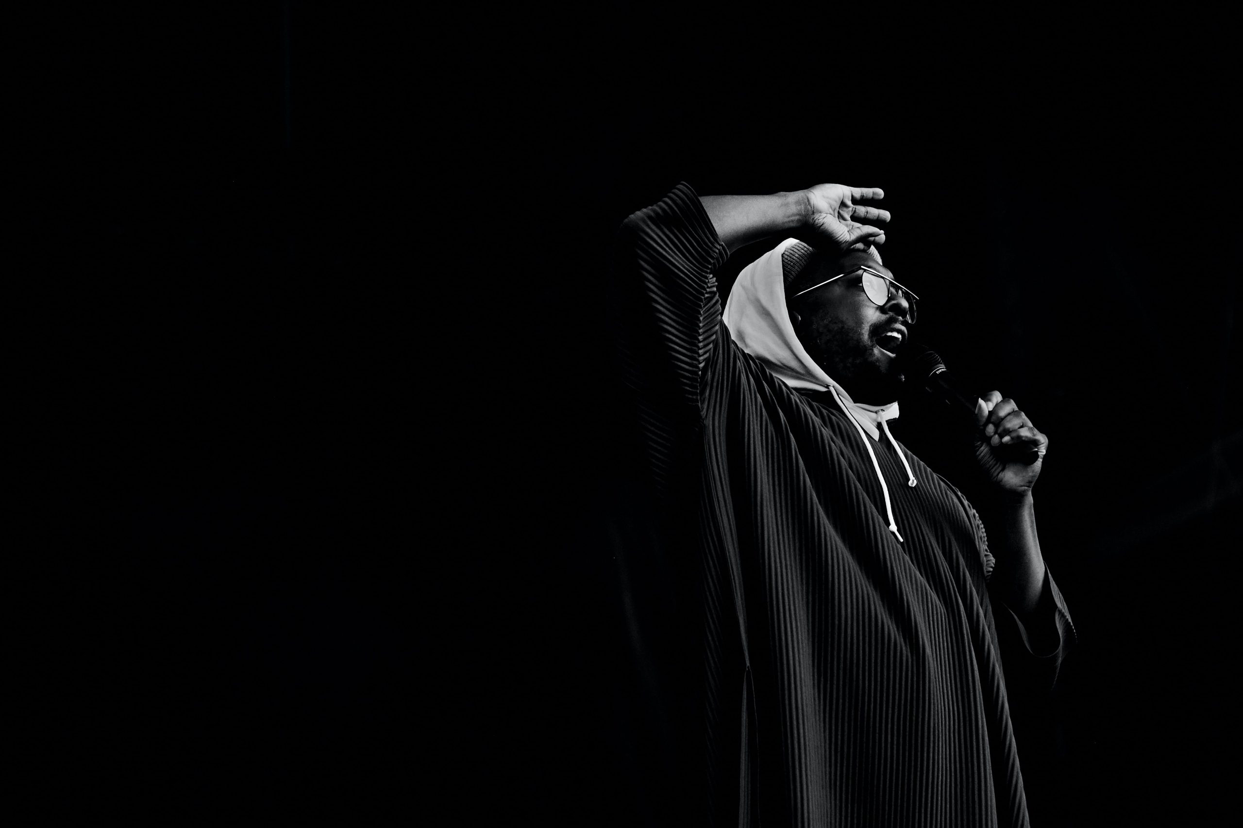
A nice photo with plenty of negative space. The image is sharp, the contrast levels are good and the composition is classic.
Not really

A cute and friendly picture for sure, but there are a lot of things happening at once. There is no clear composition, nor any negative space.
Bad

Plenty of distractions throughout the picture, with an unflattering light and bad tones-combo, makes for a big no.